|

|

|
|
产品故事 |
INTRODUCTION |
|
|
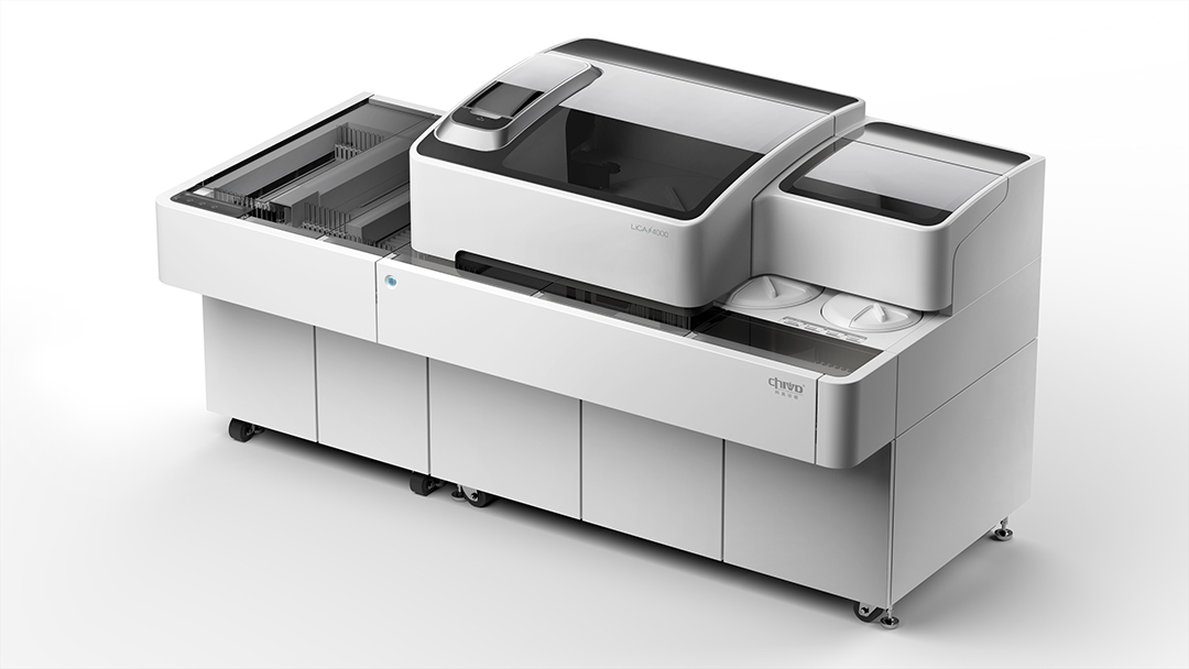
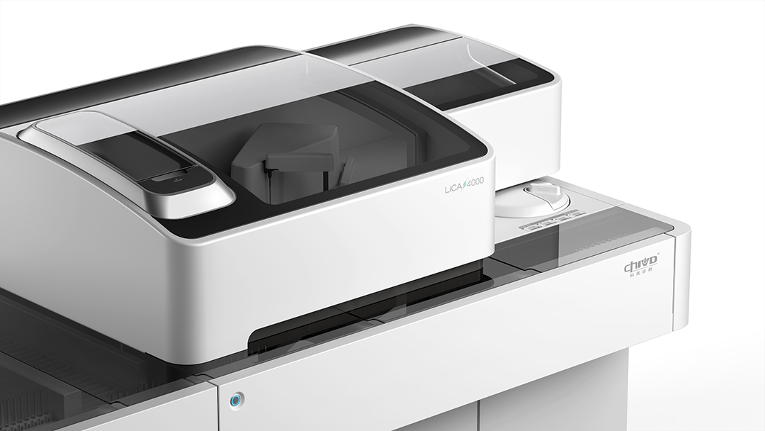
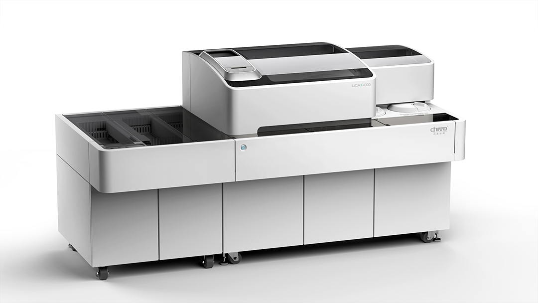
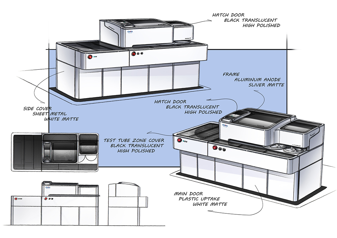
• 客户将产品定位为中高端,希望通过独特的外观,与先进的技术相结合,突破行业内追求高效、精密的趋势,打造全新的产品线。 • 检验科多是冰冷、杂乱的环境,过于强调高效、科技的产品,容易给操作者带来被忽视的感受。设计师通过柔和的造型和简洁的色块分割,赋予产品优雅、柔和的气质:产品整体采用白色为主体色,四边的圆角柔和亲切;顶面操作区整体为半透明亚克力,大面积的色彩区分,不仅在视觉上更加干净规整,更容易形成设计的视觉识别点;反应杯舱门围绕一圈哑光银色边框,在色彩和材质上做出层次,使舱门犹如一片浮岛,静静停泊在深色的表面,给人以宁静、平和之感;急停开关指示灯 、主舱门把手等部分,同样采用圆弧造型,从细节上增加一丝灵动和精致感。 • 产品前部连接流水线,将多台产品串联,满足了不同的需求,丰富检测项目、有效提高效率,并节约实验室场地空间和采购成本 |
• The product is positioned to be mid-to-high end and the customer hopes to make a breakthrough in the industry tendency of pursuing efficiency and delicacy with the product of a unique appearance combined with advanced technology and to forge a brand-new product line. • Most clinical labs are cold and messy and products focused on efficiency and technology are easy to give the operator a feeling of neglect. Our designers would give the product elegant and soft temperament through the gentle shape and simple color block segmentation---The whole product uses white as the main color, the rounded four corners soft and friendly; the operation area on the top is made of semi-transparent acrylic with a broad color division, not only visually clean and regular, but also easier to form the visual identification points of the design; the hatch of the reaction chamber is surrounded with a matt silver frame to form layers with colors and material, making it like a floating island, moored quietly on the dark surface providing a sense of tranquility and peace; the light of emergency switch and the hatch handles are also in arc design, increasing a sense of etherealization and delicacy in detail. • The front part of the product links to the assembly line to connect in series with different devices to meet different needs, enriching testing items, improving efficiency and saving the costs of spaces and procurement. |
|
|
服务内容 设计研究 造型设计 平面设计 |
SERVISE Style Design , Rearch Design , Graphic Design |
