
|

|
|
|
产品故事 |
INTRODUCTION |
|
|
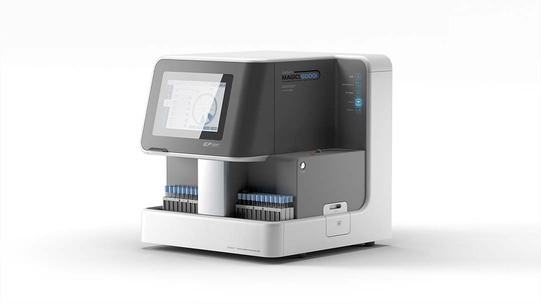
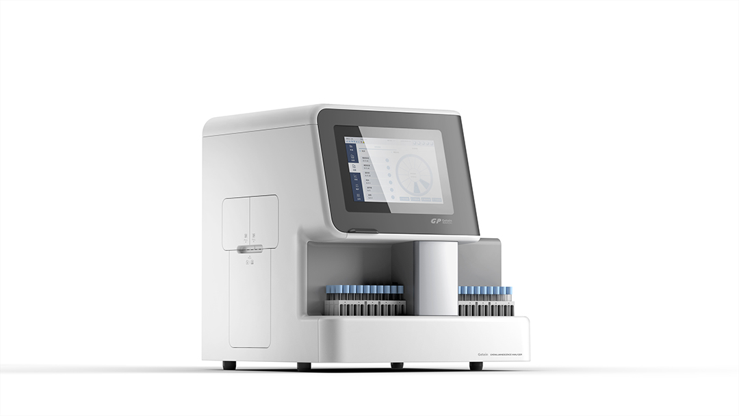
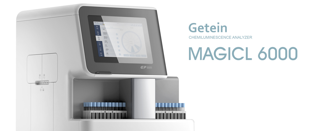
• 受到功能和排布的限制,化学发光分析仪的设计容易雷同,很难从一众产品中脱颖而出,更难以形成独特的品牌特色。 • 因此,设计师打破原有的排布限定,大胆地运用色块与转折的曲线,将区域进行划分:上半部分的深色部分为高频操作区,包括触控屏及状态指示灯,便于操作和观察;中部的中灰色区域为试剂区,造型规整易清洁;中间的银色部分,将进样区和取样区分隔开,从色彩和质感上,增加了层次;主体采用医疗白,更先洁净、轻盈。 • 产品从构成上形成了独特的视觉ICON,并通过不同的色块,打造出不同的层次,在视觉上减少厚重感,更轻盈、精致。 |
• Limited by function and layout, the design of chemical luminescence analyzer is very similar and it is difficult to be distinctive from others, and even harder to form unique brand characteristics. • To this end, the designer broke the original layout limits, boldly used color blocks and turning curves to divide the surface into different areas---the darker upper part is the high-frequent operation area containing the touch screen and indicators, easy for operation and observation; the gray middle part is reagent area with regular shape, easy for cleaning; the silver part in between separates the areas of sample in and out, adding layers with color and texture. The main body is in medical white, clean and lithe. • The product forms a unique visual icon with its structure. Through different color blocks, it forms different layers and reduces the weight in vision, leaving a sense of litheness and refinement. |
|
|
服务内容 设计研究 造型设计 平面设计 |
SERVISE Style Design , Rearch Design , Graphic Design |