
|

|
|
|
产品故事 |
INTRODUCTION |
|
|
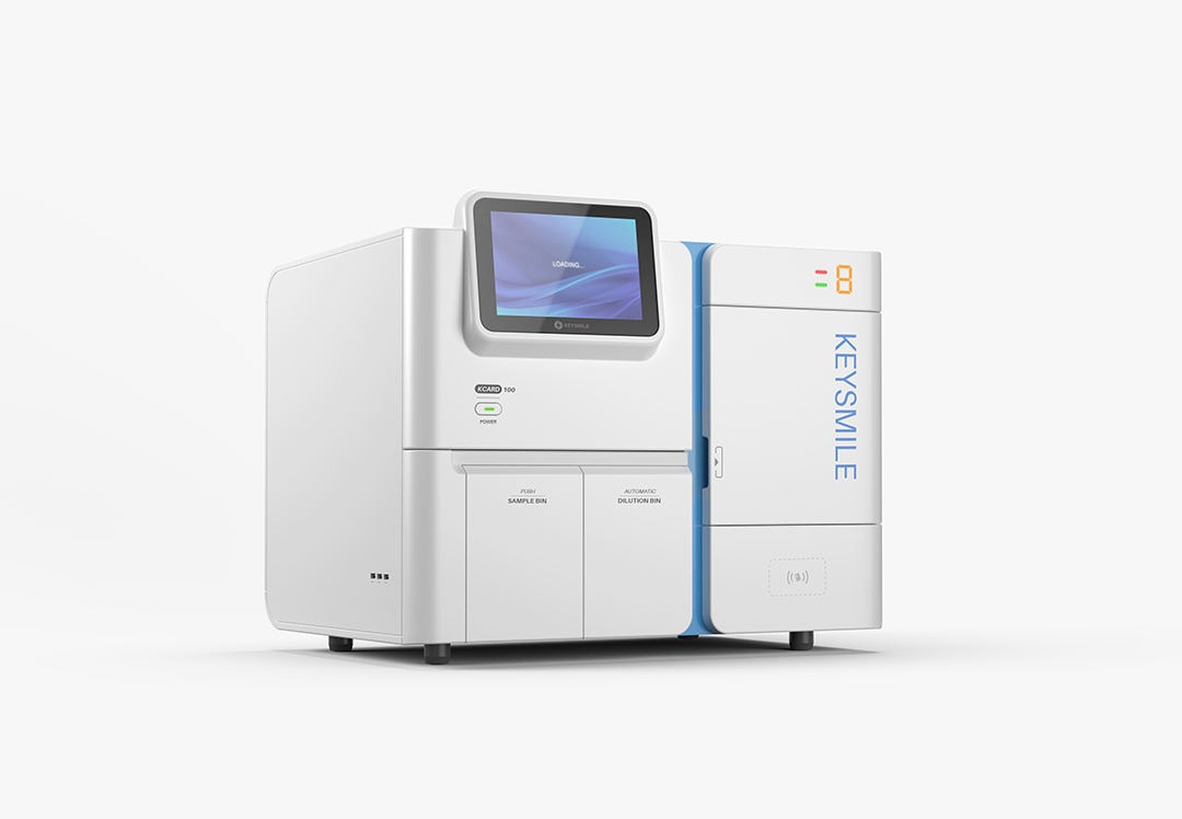
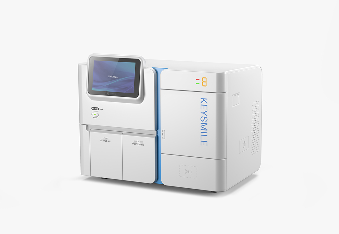
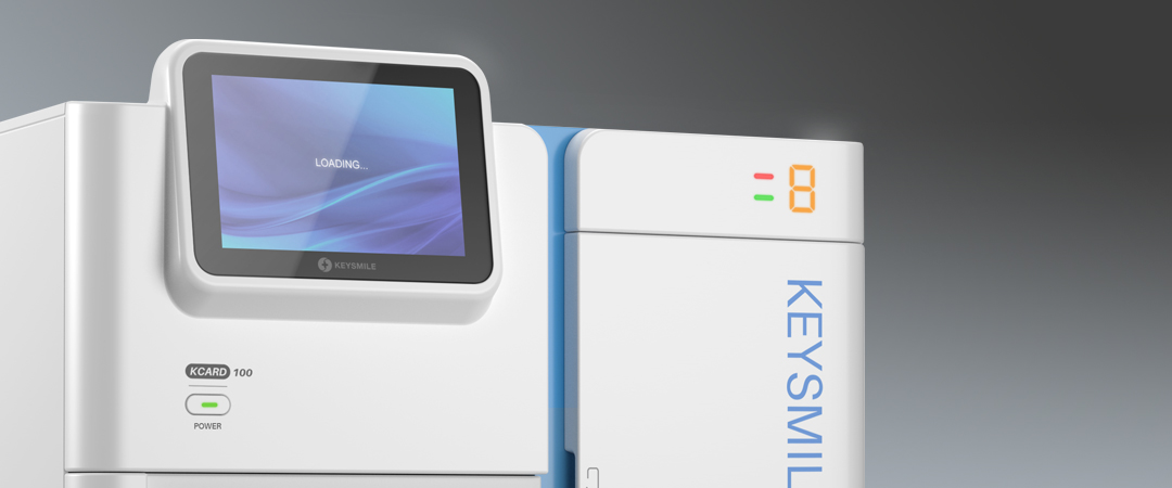
• POCT类产品通常在检验科室内使用,在寸土寸金的科室里,体积小将占有明显优势。因此,市面上的产品经常一味追求紧凑的布局,而导致视觉上参差不齐,不够美观。基于现状,设计师在不改变原有排布的情况下,改善产品视觉比例,并以此作为本次设计的切入点。 • 产品整体白色,从色彩上统一了操作区域,体现纯净优雅的气质:白色哑光与白色高亮的不同质感,丰富了层次,提升产品精致感;中间蓝色将产品分成样本区和试剂区,视觉上清爽且富有层次,提升了产品的精致感。 • 设计师通过优化开门方式,提升操作体验:试剂仓采取竖向排列的方式,方便取放;仓门下方对应状态指示灯,便于识别运用;样本区舱门采用下翻+内收的开门方式,给加样工作留出足够的空间,便于使用者的操作。 • 屏幕突出外框,契合了解构主义的理念,打破呆板的方形布局,给一成不变的科室环境带来更多不一样的操作体验。 |
• POCT products are normally used in clinical labs where space can be an issue and those small in size will be preferable. Therefore, the products on the market often blindly pursue a compact layout, which leads to uneven vision and bad looking. Based on the current situation, our designers improved the visual proportion of the product without changing the original layout, and took this as the entry point of the design. • The whole product is white, unifying the operation area with the color, reflecting the pure and elegant temperament---The different textures of white matt and white highlight enrich the sense of depth and delicacy; the blue part in the middle divides the product into sample area and reagent area, which is visually refreshing and rich in layers, enhancing the exquisite sense of the product. • Through optimizing the way to open the hatch, the designer improves the operating experience---the reagent chamber adopts vertical arrangement, easy to load and unload the reagent; the corresponding status indicator lights below the hatch are easy to be read and identified; the hatch of the sampling area adopts the opening mode of flipping + adducent to leave enough space for the sample adding work and facilitate the operation. • The protruding outlines of the screen conform to the concept of deconstructivism, breaking the rigid square layout and bringing a different operating experience to the unchanging atmosphere in the lab. |
|
|
服务内容 设计研究 造型设计 平面设计 |
SERVISE Style Design , Rearch Design , Graphic Design |