|

|

|
|
产品故事 |
INTRODUCTION |
|
|
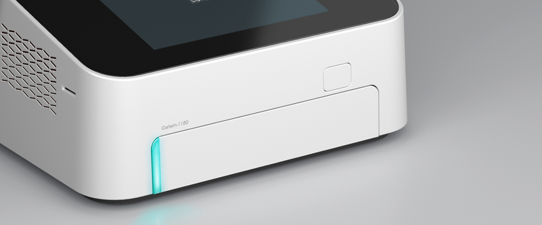
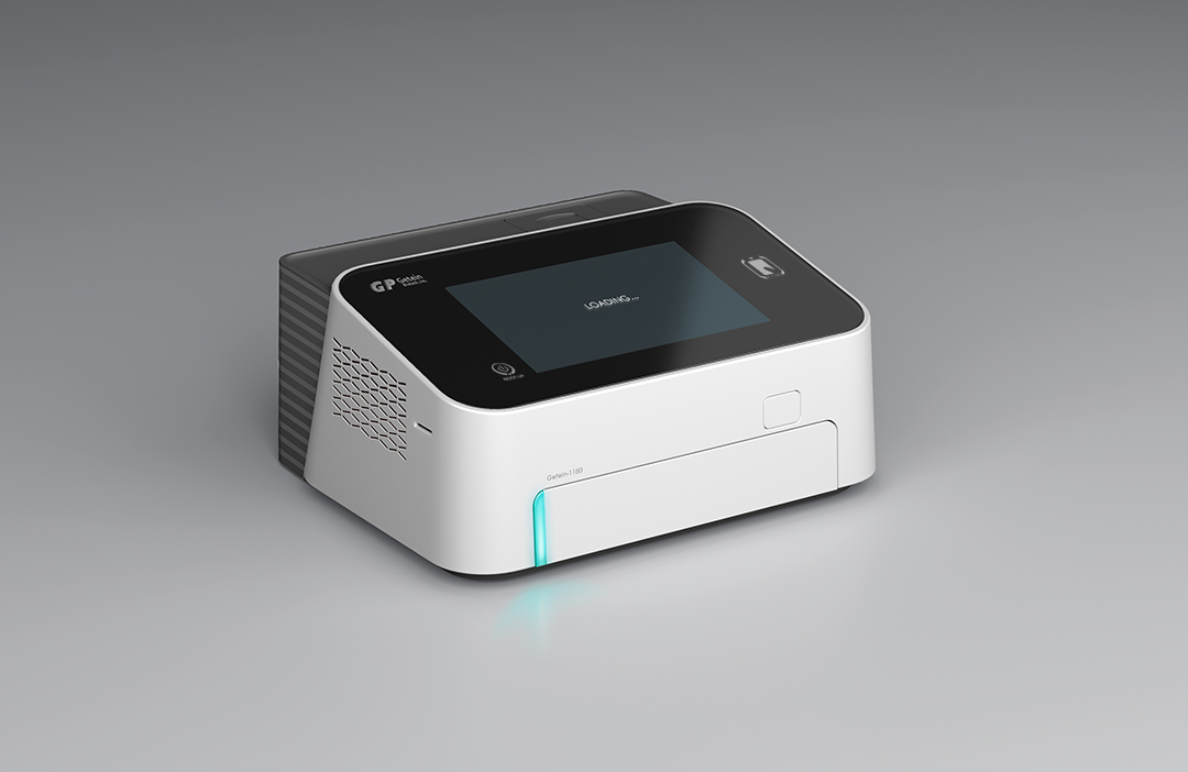
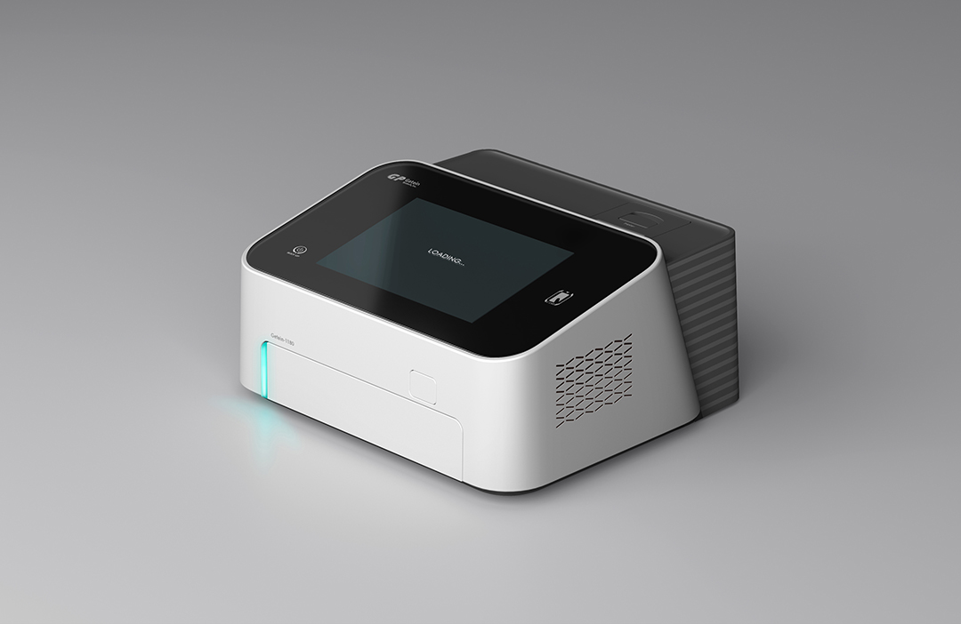
• 多通道荧光免疫定量分析仪的体积较小,构成相对简单,故而设计极容易雷同。因此,突破固有的构成模式,打造全新的产品PI,是本次项目的难点所在。 • 多通道荧光免疫定量分析仪通常在实验室使用,紧凑繁杂的使用环境,要求产品具有专业、易用、高识别度等特征。因此,设计师大胆的将产品一分为二,前半部分为主要操作区:屏幕向上倾斜,提高产品的交互感;前方放样区,设计简洁的LED指示灯作为提醒,方便操作。简约的矩形形体内,通过斜面分割,既从视觉上缩小了产品体积,又使产品整体的基础几何形态更加灵动、富有层次。这种独特的分件方式,给人以“惊喜”之感。 • 根据设计的形体,产品前后两部分以白色和深灰色做分色设计,视觉上更显小巧。深灰壳体上通过不同的表面光泽度,呈现出横条肌理,与前壳的横向出风孔呼应,使细节上更加丰富耐看。 |
• The
fluorescence immunoassay quantitative analyzer
is small in size and relatively simple in composition, so its design is very
easy to be a duplication. Therefore, the difficulty of this project is to break
through the inherent composition mode and create a brand new product PI. • As is often the case, The fluorescence immunoassay quantitative analyzer is used in the laboratory of a compact and complex environment in which the product is required to be professional, easy to use and be of high recognition. Therefore, the designer boldly divides the product into two halves. The first half is the main operation area---the screen tilts upward to improve the interaction of the product; the front sampling area is designed with a simple LED indicator as a reminder to facilitate operation. For the simple rectangular body, the volume of the product is reduced visually and the basic geometric shape of the whole product is more flexible and hierarchical through the inclined plane division. This unique way of splitting gives people a sense of "surprise". • According to the shape design, the front and back of the product are designed respectively in white and dark gray, which makes it more compact visually. Through different surface glosses, the dark gray shell presents a horizontal texture, which echoes with the transverse air outlet of the front shell, making the details more rich and presentable. |
|
|
服务内容 设计研究 造型设计 平面设计 |
SERVISE Style Design , Rearch Design , Graphic Design |


